It’s a weird word isn’t it? But a good one. It refers to the practice of making something new look like something old. As a kid I remember seeing Morris Minors with wooden frames on the outside that made them look as if they were from the Tudor period. You think I’m making it up? Okay, here…

Back then I thought they looked ridiculous. Now I’m learning towards them being quite cool. Must be an age thing. What I don’t understand though is why the design ever made it off the drawing board in the first place. Who ever thought a “half-timbered car” as Dame Edna Everage once put it, was a good idea. Obviously, someone did. Not just at Morris either; they sold pretty well so clearly the general public bought into the idea too.
When computer interfaces started to become a thing, i.e. after the clunky chunky graphics of the 8-bit computer era, it didn’t take long for software designers to get on board the skeuomorphism band wagon. Perhaps the thinking there was that it might lure people into using the software if it looked a bit more familiar. Hence, we started seeing things like Apple’s Notes with its yellow lined pages and faux page tear-offs along with a stitched black leather binder showing around it. It actually looked really good, apart from one thing – the infamously awful Marker Felt font which instantly made the app virtually unusable due to its unbearable hideousness.
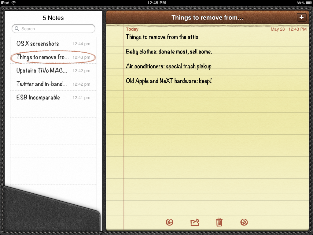
That was unfortunate, and was no doubt a major reason why, after the Steve Jobs era was over, Apple ditched skeuomorphism with a vengeance. Nowadays their approach is minimalist. Some might say beyond minimalist. I certainly would. In this age of glorious 4k retina displays, Apple are treating us to some of the most bland software interfaces since those good old days of 16-colour 8-bit home computers.
Now we have apps that we don’t want to use because they are just so utterly dull. Thankfully, third party developers have not given up on skeuomorphic apps just yet. So here are a few examples. I’ll let you make up your own minds which you prefer. Personally, I’m old school.
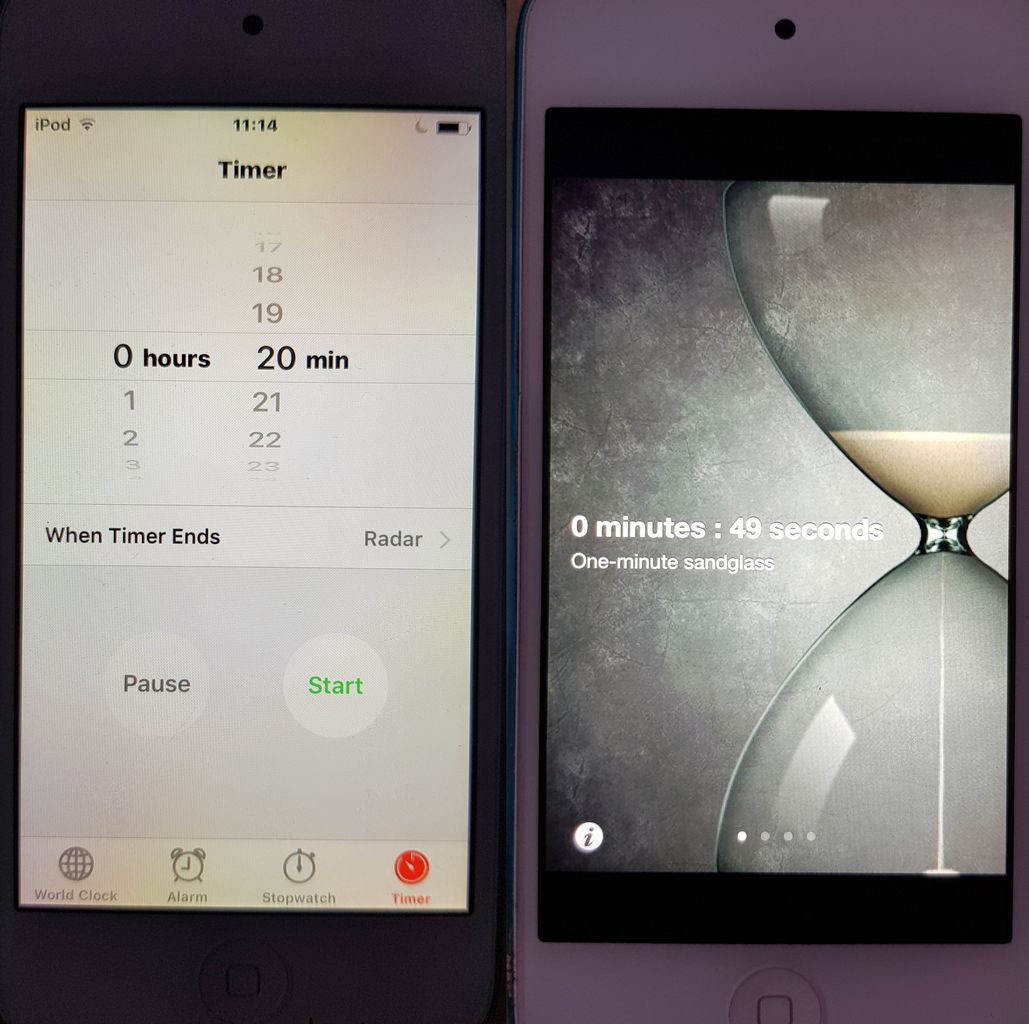
Here is Apple’s dismal timer compared with an hourglass simulator.
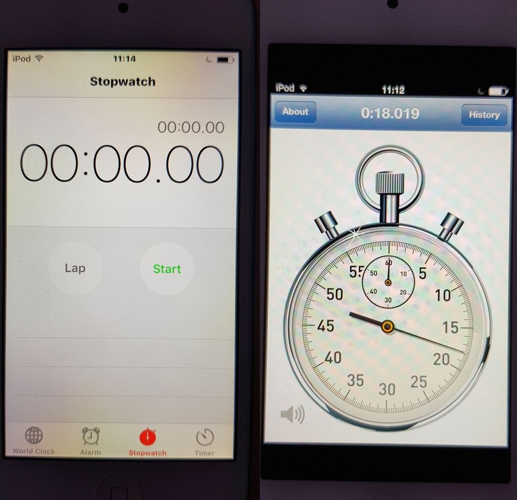
Similarly, Apple stopwatch against a more traditional rendering.
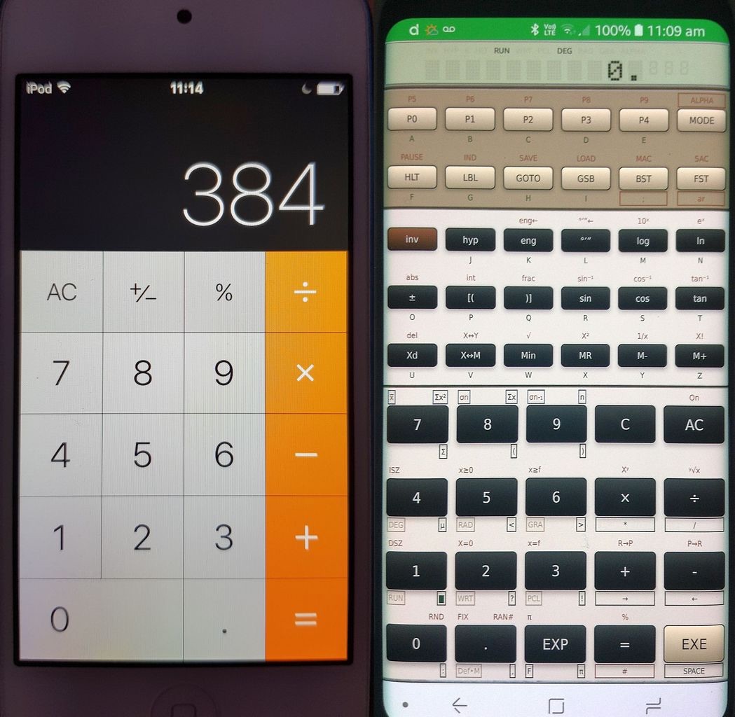
Calculator minimalist-style will no doubt be fine for some but I prefer a full-blown Casio FX602P emulator, fully programmable into the bargain. I bought one of those beasts back in the day for the kind of money that would nowadays buy an iPad.
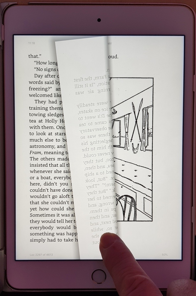
Kindle holds on to skeuomorphism with its glorious, though admittedly pointless, page-curling. For me, this is one of the best ever examples of it – eBooks can seem so dry compared to the real thing but this clever illusion really brings them alive on an iPad.
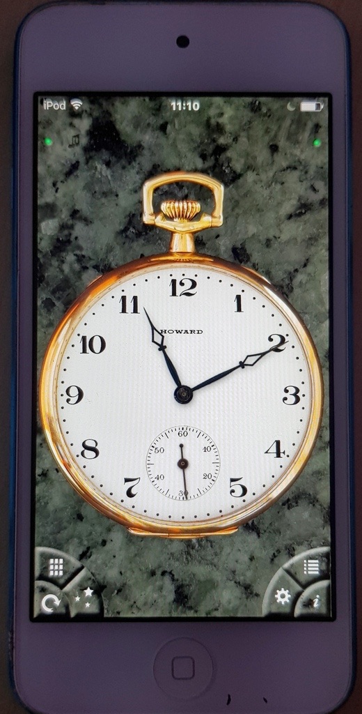
And finally, a proper old-fashioned pocket watch on a considerably more modern pocket device. Why? you might ask. Because it looks lovely, is how I reply.
If I’m honest, I doubt I would use Apple devices any more if it wasn’t for the third-party apps. I have heard rumours that we will see a totally revamped version of iTunes this year; perhaps even a replacement for it. I remain hopeful that it will be at least vaguely interesting to look at. The current version, particularly on iPhones and iPads, is so mind-numbingly dull it makes me want to weep. With any luck the next regime change at Apple might usher in a new dawn for attractive software. Until that happy day I will keep trawling through the weird and wonderful alternatives on the app store.